Case study #4
Helping patients decide whether to use a self-service healthcare platform
2020-2021 Diagnostic robotics Ltd.
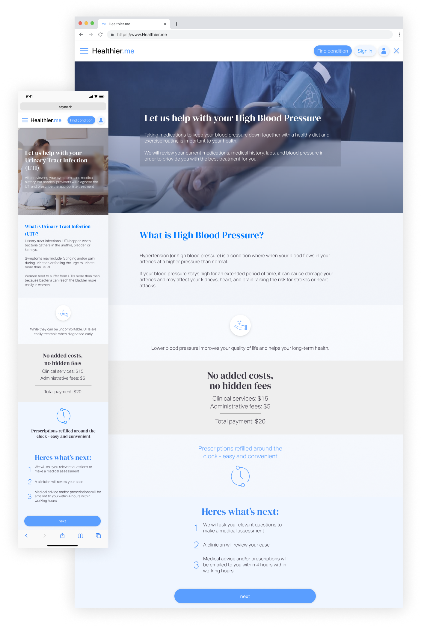
"Healthier.me" is a platform for getting medical services online: the user chooses the service, answers a medical questionnaire, and receives a response from an MD in 4 hours. This use case focuses on a decrease in transition from the "service page" to the beginning of the process: medical questionnaire, registration, payment, etc.
The first service page only included the name, price, and process steps. This was an MVP version that was low in content and meant to be improved with content.
With the release of the MVP version of "Healthier.Me" in the product funnel, we saw an intense decrease in users' transition from the "service page" to start getting the service by answering the medical questionnaire. The drop is logical: users who want insight on the page, the service does not suit them, the price is too high, etc. My goal was to improve the transition of these users and get more users to start the process.
The research led to three main topics that needed to explain to the user:
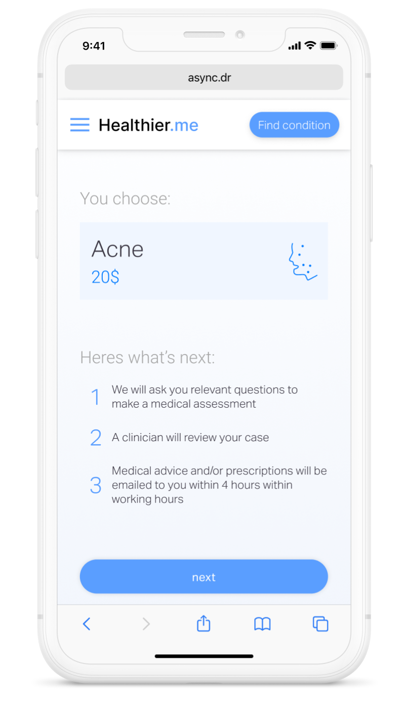
Create one page that supports more than forty medical services
After understanding the content that needed to be added, I started to plan the components for each type of content.

The planning led me to create two types of components:
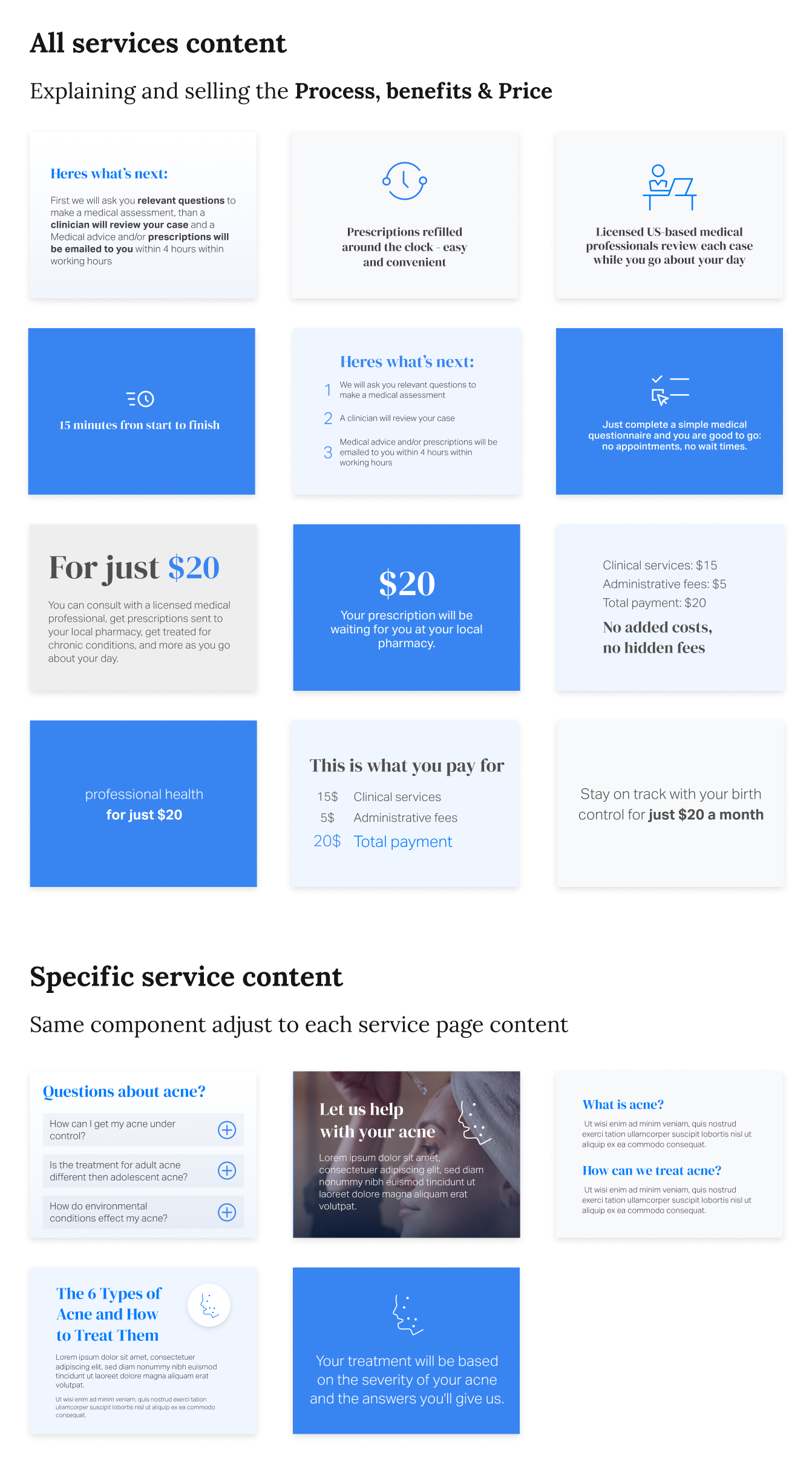
Next was creating a final with all content and testing it with different services’ changed content.

After creating the design, I decided to test the new service page using a testing platform since I needed to validate that the ideas were clear to the reader.
I presented users with the following questions on the testing platform:
User explain the page
The term "medical questionnaire" wasn't clear to users, and many questions were about "How are they going to get my medical history and my blood pressure?"
100% - everybody said the price was clear and straightforward.
Based on the tests and decision to implement the new service page, the next phase was to better explain the "medical questionnaire”.